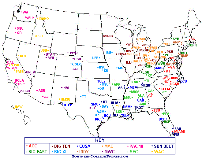
 This map was found by doing a Google search for "Map of College Football Teams." I chose this map from http://southerncollegesports.com/football_location_map2.html because I like college football and this map depicts all Division 1 programs, and this happens to be a map I had not seen before. This map's strength is showing not only where each college exists, but also what conference each team represents through the use of color-coded labeling.
But I also chose this map because of its numerous shortcomings. Obviously, it was created without the use of proper mapping tools/software (looks like an MS Paint product) and without any regard for accuracy. Being familiar with Texas geography, I can find clear faults with the placement of several of the teams in that state. Clearly, it is designed by a College Football fan, for College Football fans, and it's an assumption on the part of the creator that his viewers will come with a knowledge of each team's abbreviation. Even so, the author of this map does a poor job of ensuring that his labels can clearly be read. This is particularly a problem in the Mid-West, where the Big Ten and MAC teams are clustered. Finally, it's notable that this map shows a bias in its coloring. The map was presumably authored by a Southerner, and as such, the author saw it fit to depict the PAC-10 teams in the color pink - which may seem innocuous to a casual viewer, but I believe it was more than likely a direct jab at the West Coast style of football.
No comments:
Post a Comment